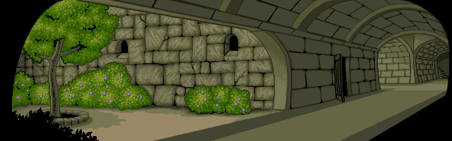
Castle garden is a prime example of the “wrong style syndrome”, the result of working on the art in two separate locations in the pre-internet 90s. My take on the castle walls turned out okay’ish, but if one had to describe the textures and colors with one word, it would be “dull”.
Once the look for the castle wall had been nailed in the castle gate scene, it became obvious that the garden needed to be reworked. It was also an ideal opportunity to rethink the player’s point of view on it.
Luckily I had some foresight to save lots of work-in-progress stages. Following is a series of snapshots of the painstaking process of pixeling a background image from a rough sketch to a finalized version.
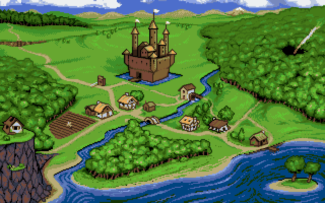
The aerial view of the village was originally sketched just for own our reference, but soon we were planning to use it as a background for the main menu. Following is a walkthrough of the pixeling process.
This slideshow requires JavaScript.
Original pencil sketch of the aerial view of the village
Moving some buildings to better fit the image, preliminary coloring
Finding base colors for grass and foliage
The look of the forest and grass areas finalized
Cliff face texture and buildings made based on the finished game backgrounds
More buildings and field added
All grassy areas base colored
Cliff face finalized
Island and water areas finalized, scarecrow added in the field
Castle first iteration, background hill colored in
Castle finalized
Forest areas finalized
Hill iteration to make it seem more like an obstacle
Working to find a good look for the rocky hill
Decided to get rid of the hill, replaced it with a lengthier chasm
Adding details
Added a tollbooth in the crossroads, color tweaks
Final tweaks to the buildings to make them match with the game backgrounds
The image was finished, yet it became obvious that the image would benefit from some small animations to liven it up.
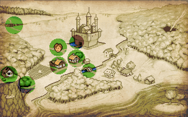
Once we had all the in-game scenes linked, we realized having a quick travel option would be ideal. The aerial view was promptly re-purposed into a handy map.
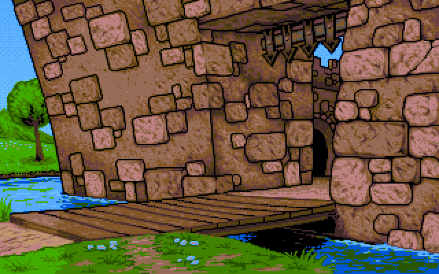
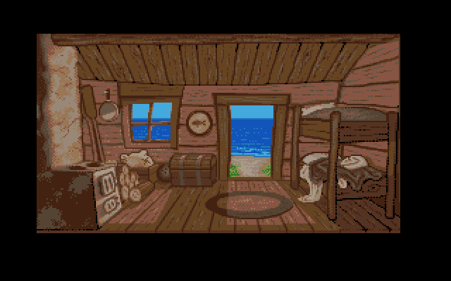
Here is another example of a scene (1993) with nothing really wrong in it… apart from the style. The excessive smoothing and blending with muted colors gave the image a stuffy and somewhat bland result.
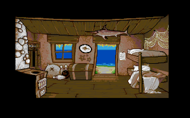
The remade image (2007) addressed most of the issues. The colors are more vibrant, and there are less of them. Everything was redrawn with a more crooked and “top heavy” look. The darker outline helped emphasize some key items relevant to the quest and the main character’s background. The simple fireplace animation was added to relay a sense of living space.
When the pixeling of the background art started, the workload was divided for myself and the friend behind the sketches in the previous post. The penciled designs were run through a handheld scanner (state of the art technology in the early 90s), which allowed us to start working directly over the sketched pencil lines. My friend started on the cliff top background, I took the path to the cliff. This is the end result.
As we were both working at home in a Skypeless era, there was no simple way to keep the style consistent. In addition to this we used portable CRT TVs which would fuzz the image (hardware antialiasing well before its time) and distort the colors. The official Amiga monitors would’ve fixed these shortcomings, but they were a luxury we couldn’t yet afford. There were some who actually preferred the softer image of a TV to the sharp crispness of a monitor.
At the turn of the century the second major attempt of getting the game done took place. I took a good look at the graphics finished so far, and couldn’t help but realize the huge disparity in the quality of the background images. Ones made by my friend were skillfully stylized with a bold selection of colors. My own efforts appeared over rendered with a stuffy and muddled color palette.
The only way forward was to redo all the background images I had made. Here are some images of the process.
This slideshow requires JavaScript.
The original image (1993)
Using crispier colors and the preferred stylization was started (2001)
The same process taken a bit further (2001)
Adjustments on the look of the cliff face and the shack were made to better link the scenes (2001)
Tweaking of the sky and clouds, final color adjustment (2007)